Noah Koshy
Designer · Sydney
Case № 09
Digital Design
Planet 11
In a team of four, I owned how live sensor data from UTS Building 11 was visualised as a planet: people as buildings, CO₂ as clouds, oxygen as trees and temperature as colour, so it could be understood at a glance.
RoleInteraction Designer · UTS
Team4 people
Timeline
I ownedData Visualisation Method & Narrative
The sixty-second version
Problem
The sensors in UTS Building 11 feed live Big Data through an API, and it had to be easily understood without a detailed explanation alongside it.
What I did
I owned the data visualisation method and narrative: representing the building as a planet, and mapping each sensor metric to a visual element that was thematically relevant to it.
Result
After repeated testing and adjustment cycles, it communicated changes in the data over time without overwhelming the viewer.
↓
More details below if you want the reasoning.
§ 01
The Problem
Live data that had to make sense at a glance, without an explanation alongside it.
"Visually simulating and representing big data, and translating complex datasets into a navigable, planet-like interactive surface."
What I couldn't change
01
The data came from the sensors already in UTS Building 11, through an API.
02
It had to be accurate and update in real time, across multiple time periods and ranges.
03
A completely digital prototype, with all of its functionality in a Java codebase.
§ 02
The Work
Two stills from the same day, around two hours apart.
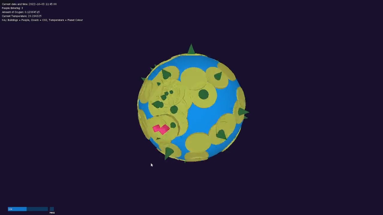
Plate 01. 11:45, with the live readings and the key in the top-left corner, so viewers could also see the raw data.
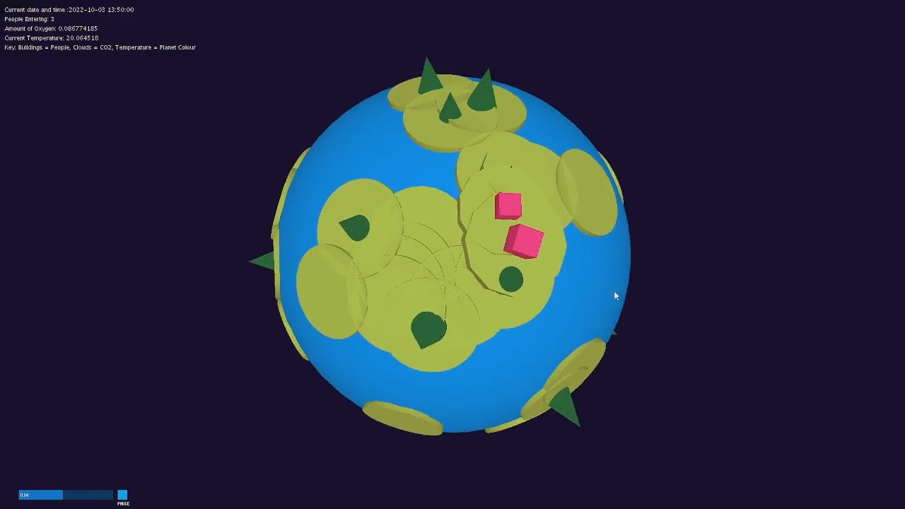
Plate 02. 13:50, zoomed in, with CO₂ levels shown as clouds, people as buildings and oxygen levels as trees.
§ 03 — Decisions & trade-offs
The planet metaphor was contextually appropriate and made the underlying data easy to understand at a glance.
The sensor selection was done first, with the mapping occurring after.
Decision 01
Choosing which sensors to use
Chose
A people counter, CO₂, oxygen and temperature sensors as the chosen input sources.
Gave up
The large number of other available sensors, each with multiple possible interpretations of how they could be visualised.
Why
Their metrics overlapped or had a strong enough relation to each other, and the data remained meaningful during both peak and non-peak activity periods.
§ 04
Impact & what I'd change
A creative approach to data visualisation, driven by live data.
Looking back
One particularly notable outcome from the testing was adding a slider to let users control the speed of the time period flow, adding a simple but meaningful personalisation and layer of user interaction. If I did it again, I would test it with people seeing it for the first time, to confirm it could be understood without an explanation.
— Noah
Digital Design
Data Visualisation
Java
© Noah Koshy, 2022-2026.
Planet 11 · Scrapbook-styled Portfolio